FREE SHIPPING OVER $25

  FREE SHIPPING OVER $25

Black Friday is Live! Save up to 30% Site-wide
Prices won't go lower!
FREE DOMESTIC SHIPPING
Add $100 to Get 20% Off
  • 10%
  • 20%
  • 25%
  • 30%

Brand Guideline

LOGO MARKS

The following guide is meant to show proper usage of the Hayabusa logo mark. While these are meant as guidelines, good design sometimes requires rules to be bent. For instances when this needs to be done, please feel free to reach out to our design team through your contacts at Hayabusa. 

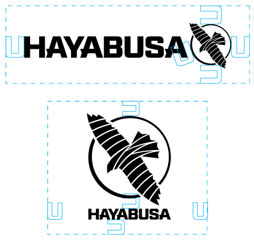
To the right, you can see the two main lockups. 

The Horizontal (1) should always be the primary mark. 

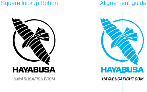
The square lockup (2) is to be used in situations where a more vertical design is required.


MARGINS

Please follow the margins for placing elements near or around the logo as shown.

Note that the letter "U" from the word mark is used for margin spacing.


REGISTRATION MARK

For situations where you need to include the registration mark, it should always be applied as small as possible, but making sure it is legible. Never go smaller than 4pts.

For alignment, on the Horizontal lockup, it should be nested at the cross point of the upper and rightmost edges of the icon circle as shown on the right.

For the square lockup, it needs to be nested at the cross point between the inner edge of the icon's circle and the first back wing point as shown on the right.


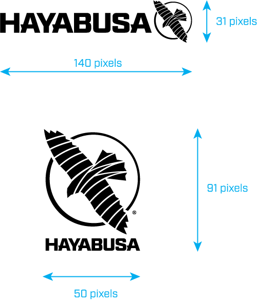
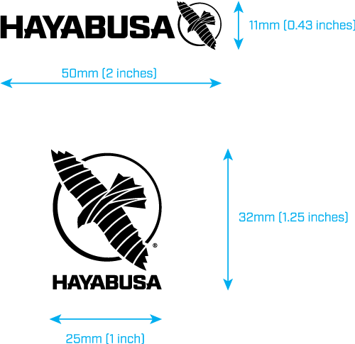
MINIMUM SIZES

Here are the minimum sizes the logo should be used for Web usage. 

Here are the minimum sizes the logo should be used for Print usage.


SLOGAN OR URL USAGE

Here is how to apply a slogan or URL to the logo mark. The first example is the "Right Aligned" option. This is a good way to do it for placement on the bottom of a print ad for example.

The text should be aligned to the bottom of the icon's circle vertically and horizontally to the last "A" from the word lockup (text aligned right).

The text should never go past the middle of the "Y" in the word lockup and the text height should never be bigger that the negative space below the horizontal bar in the "H" of the word lockup.

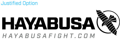
The second example is the "justified alignment" option. This is good to use for banners, business cards or anywhere the logo is used on its own and requires a slogan or URL with it.

The alignment for this one should be justified to the word mark, increasing the text tracking to reach the necessary width.

The text height should never be bigger that the negative space below the horizontal bar in the "H" of the word lockup.

The last one is when you need to use the square lockup, for the back of a T-Shirt for example or and free standing vertical banner.

The text height should never be bigger that the negative space below the horizontal bar in the "H" of the word lockup.

It should be center aligned below the word mark, using the width of the "U" as the spacing marker.


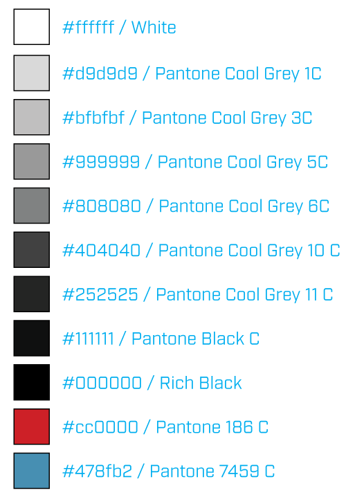
BRAND COLORS

Here is the color palette to use for the Hayabusa Brand identity. Note that the primary colors for the logo mark should always be White or Black. 


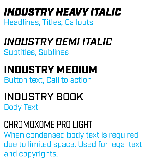
BRAND FONTS

The font used for Hayabusa is the Industry font family. To the right is a guideline of which version to use for the type of content you need to generate. 

If you have an Adobe Creative Cloud account, you can sync it to your account for free. 

Click here for instructions on how to do this. 

If you require the font and do not have an Adobe Creative Cloud account, please contact us in order to get it.


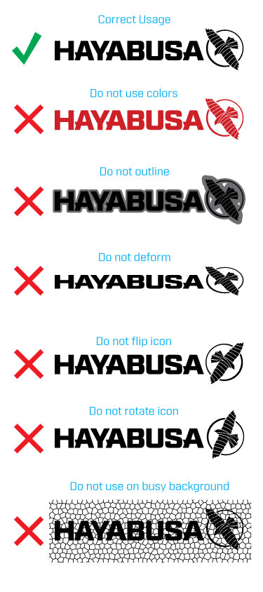
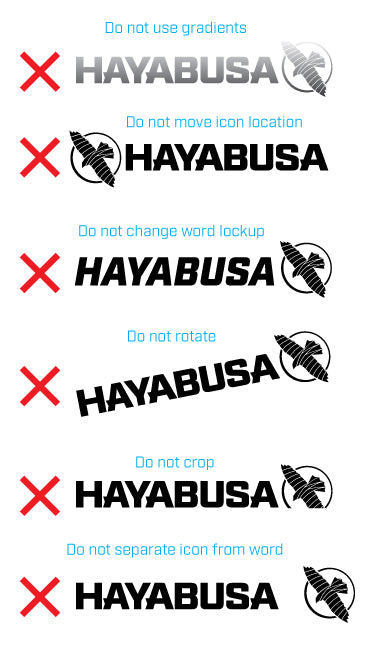
LOGO USAGE

Here are the dos and don'ts for the logo usage. These rules apply for both versions of the logo, horizontal and square lockups. Feel free to contact us if you have any questions.